18 March 2026 • Branding & Logo Placement • 8 min read
Placing a logo on a promotional product involves more than personal preference. You need to consider the available print area, printing technique, visual contrast and how the product will actually be used. Getting these factors right helps create a product that stands out, is kept and becomes part of everyday life.
Recommended Logo Positions by Product
| Product | Primary position | Alternative | Avoid |
|---|---|---|---|
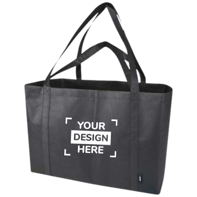
| Bag | Front, upper centre | Front, large print area | Base, handles |
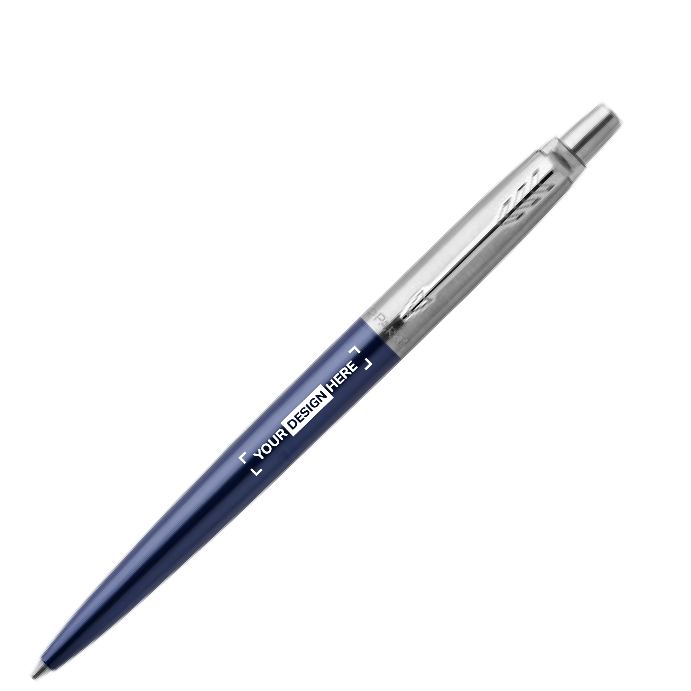
| Pen | Barrel, centre | Barrel, upper third | Clip, tip area |
| Notebook | Cover, bottom right | Cover, centre | Spine, cover edges |
| Mug / cup | Front, centre | Front, upper area | Base, inside of lid |
| T-shirt / clothing | Left chest | Upper back, centre | Sleeve seams |
| USB stick | Main body, flat side | — | USB connector, narrow sides |
Understanding Print Areas
Before deciding where to place your logo, it helps to understand the technical terminology. These terms come up regularly when working with suppliers and printers. Knowing what they mean can prevent misunderstandings and save time.
- Print area
- The maximum area available for printing, measured in millimetres (width × height). No part of the logo may extend beyond this area. You can find it in the technical specifications for each product.
- Safety margin
- The recommended space to leave inside the print area. It accounts for production tolerances, potential shifts in placement and proximity to seams or edges.
- Vector file
- Ideally, supply your logo as a vector file (AI, EPS or SVG) so it can be resized without losing quality. Even high-resolution PNG or JPEG files may not be suitable for certain printing methods.
- Minimum line thickness
- The thinnest line in your design that the printing process can reproduce clearly. This varies by technique and is usually measured in millimetres. Lines that are too thin may disappear or become blurred.
- Placement specification
- A description of where the logo should appear, such as top centre or bottom left. Its position can also be specified in millimetres from a reference edge.
Recommended Logo Positions by Product
Each type of product has its own physical limitations and typical uses. A logo placement that works perfectly on a bag may not work on a pen.
Personalised Bags
The upper front of a bag is usually the most effective position. When the bag is carried over the shoulder, the logo remains visible around hip height. For a balanced result, centre the design horizontally and leave enough space around the edges.
Personalised Pens
The barrel is generally the most practical printing area. Position your logo in the centre or slightly higher so that it can be seen while the pen is being held. The design should usually run parallel to the pen’s length.
Personalised Clothing
The left chest works well for a subtle, professional look, while the upper back provides a larger area for a more prominent design. For jackets or polo shirts, the left sleeve may also be suitable, depending on the garment and available print area.
The Science of Visibility
Not every position on a promotional product is equally noticeable. Research into visual attention suggests that people tend to focus on certain parts of an object. Understanding how people look at and use a product can help you choose a more visible location for your logo.
The basic principle is simple: contrast draws attention. A logo that stands out clearly against its background is generally easier to notice and recognise than one that blends into the surface.
Check contrast before approval
As a practical design check, aim for strong contrast between your logo and the product colour. A contrast ratio of 4.5:1 is a WCAG benchmark for normal-sized digital text, although it is not a mandatory standard for logos printed on physical products. Always assess legibility on the actual item as well.
A logo that nobody notices is a missed branding opportunity. Before approving the design, print a test version and view it from two metres away. If the text is hard to read, consider increasing its size or improving the contrast.
Simplifying Colours Without Losing Impact
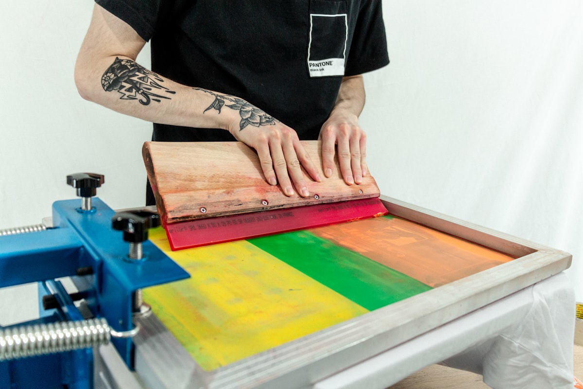
In promotional printing, a simpler design can often produce a cleaner result and keep costs under control. The best approach depends on the product, the print method and your brand guidelines.
| Technique | Available colours | Gradients? | Effect on cost |
|---|---|---|---|
| Screen printing | 1 to 4 Pantone colours | Limited (halftones) | Often priced per colour |
| Pad printing | 1 to 4 colours | No | Often priced per colour |
| Digital printing | Full colour (CMYK) | Yes | Depends on quantity and process |
| Laser engraving | 1 (engraved finish) | No | — |
| Embossing | 1 (foil or blind embossing) | No | Depends on the foil and finish |
The Artwork Approval Process, Step by Step
The artwork proof is your final opportunity to check the design before production. At this stage, you confirm the logo’s position, size, colours and overall appearance. Reviewing the proof carefully can help prevent costly mistakes.
A digital proof shows how your logo will be positioned and sized on the product, together with its intended colours. A physical pre-production sample can also show the real finish, feel and possible printing variations. This can be especially useful for large orders or complex decoration methods.
Explore Products at Loopper
Get Your Logo Placement Right with Free Design Support
Loopper can help prepare your artwork and position your logo on your chosen product at no extra charge. Upload your design to get started.
Browse All Promotional ProductsFrequently Asked Questions
What is the print area on a promotional product?
The print area is the space defined by the manufacturer where a logo or design can be applied. It is listed in the product specifications and determines the maximum size of your artwork. Your design must fit within these boundaries.
Where should I place a logo on a pen?
The main printing area is usually the barrel, either in the centre or towards the upper third. Position the logo so it remains readable when the pen is held, typically parallel to the barrel.
How many colours should a logo have on a promotional product?
One or two colours can be a practical choice for many traditional printing techniques. Additional colours may increase costs and make registration more complex. However, full-colour digital printing can also be a good option for detailed logos.
What is an artwork proof, and why is it important?
An artwork proof is a digital or physical preview that you approve before production begins. It lets you check the logo’s placement, size, colour and overall appearance, and request corrections before the order goes to print.
What is the most visible logo position on a bag?
The upper central area on the front of the bag is often the easiest to see. It keeps the design prominent when the bag is carried over the shoulder, although the ideal placement depends on the bag’s shape and how it is used.